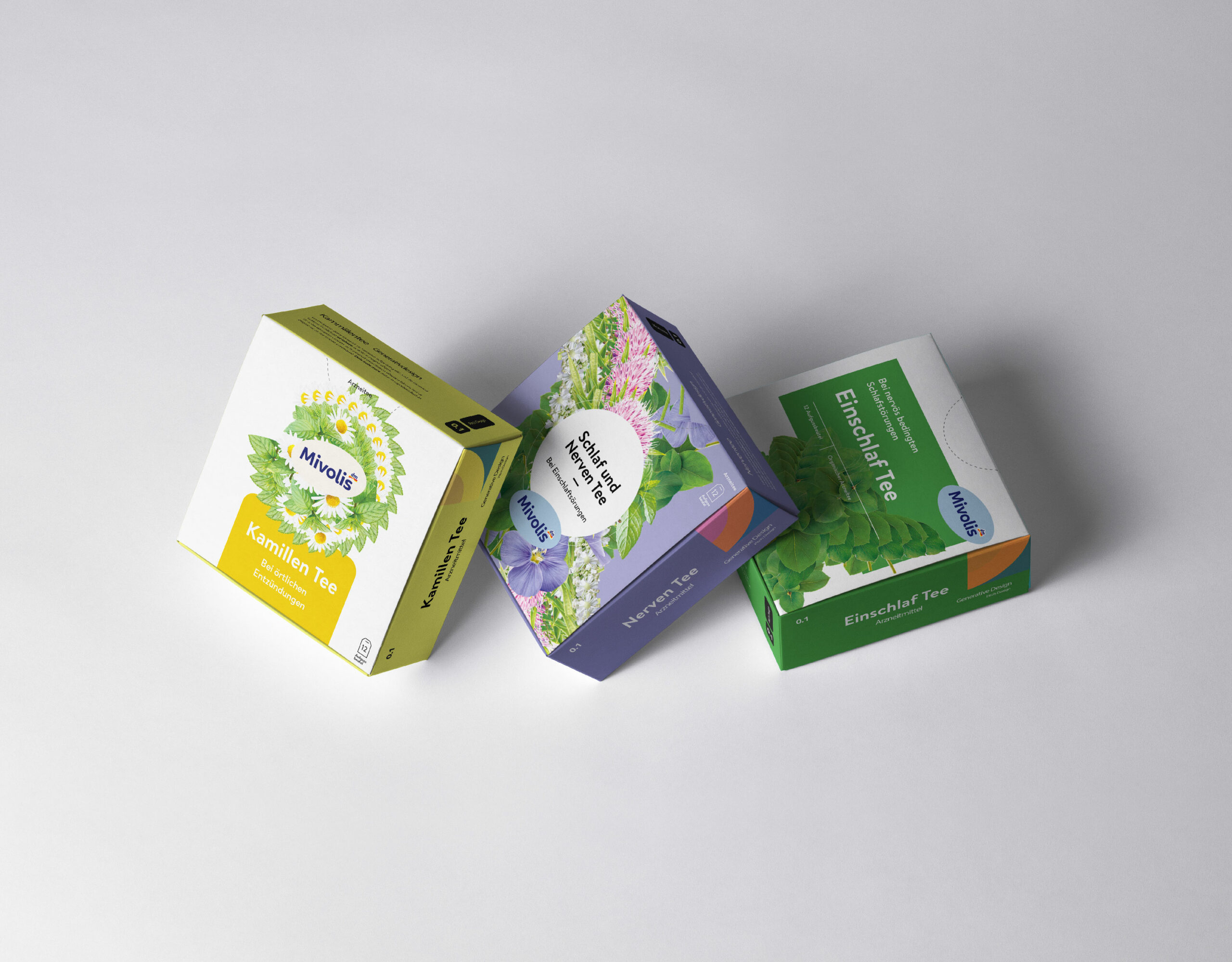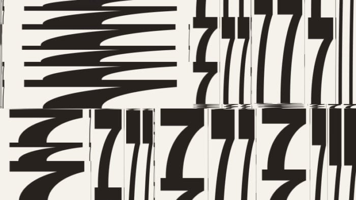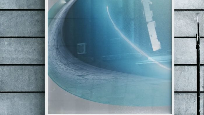
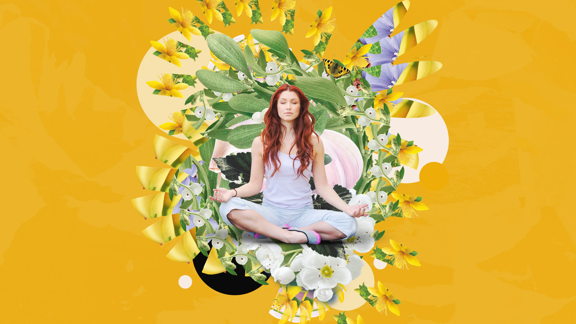
Mivolis Artifeel. A dynamic brand design that creates scalable, human-centric designs that celebrate individuality and connection. A generative branding tool that combines natural forms and vibrant textures to create unique, personalized designs while maintaining scalability and cohesion.
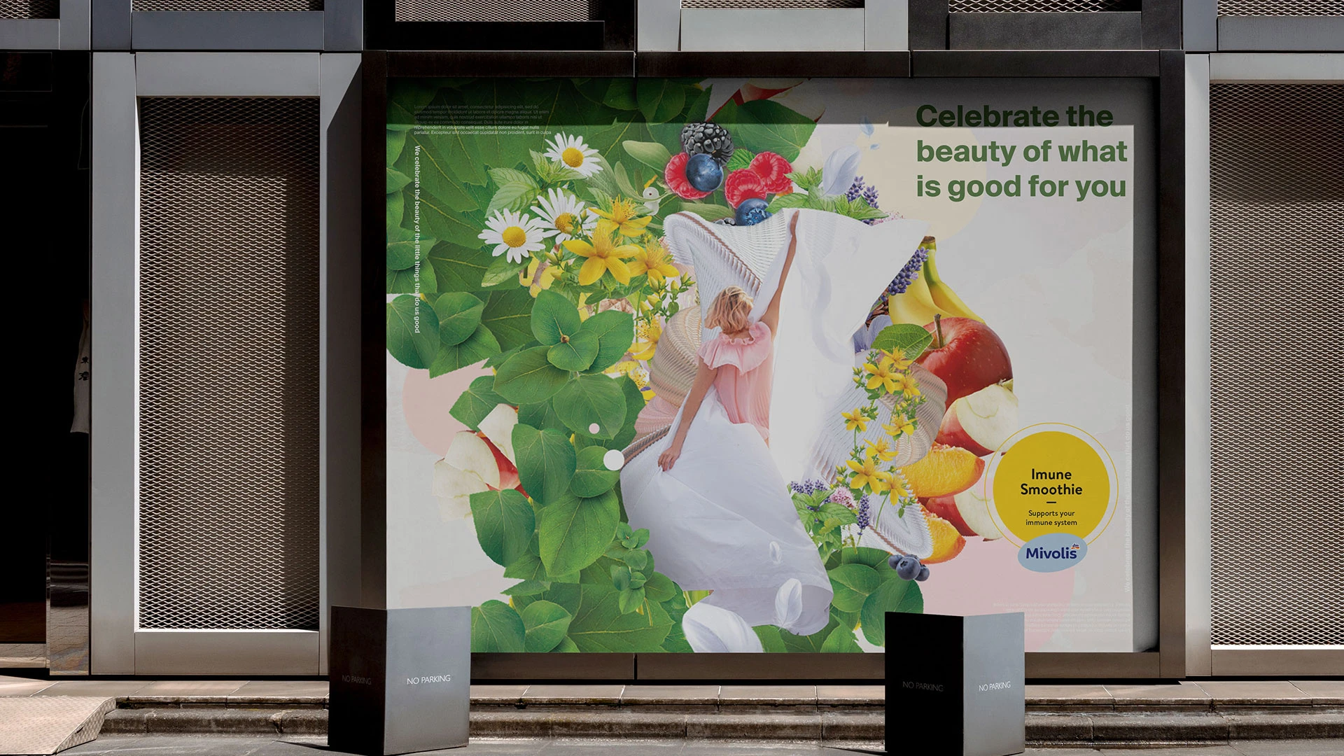
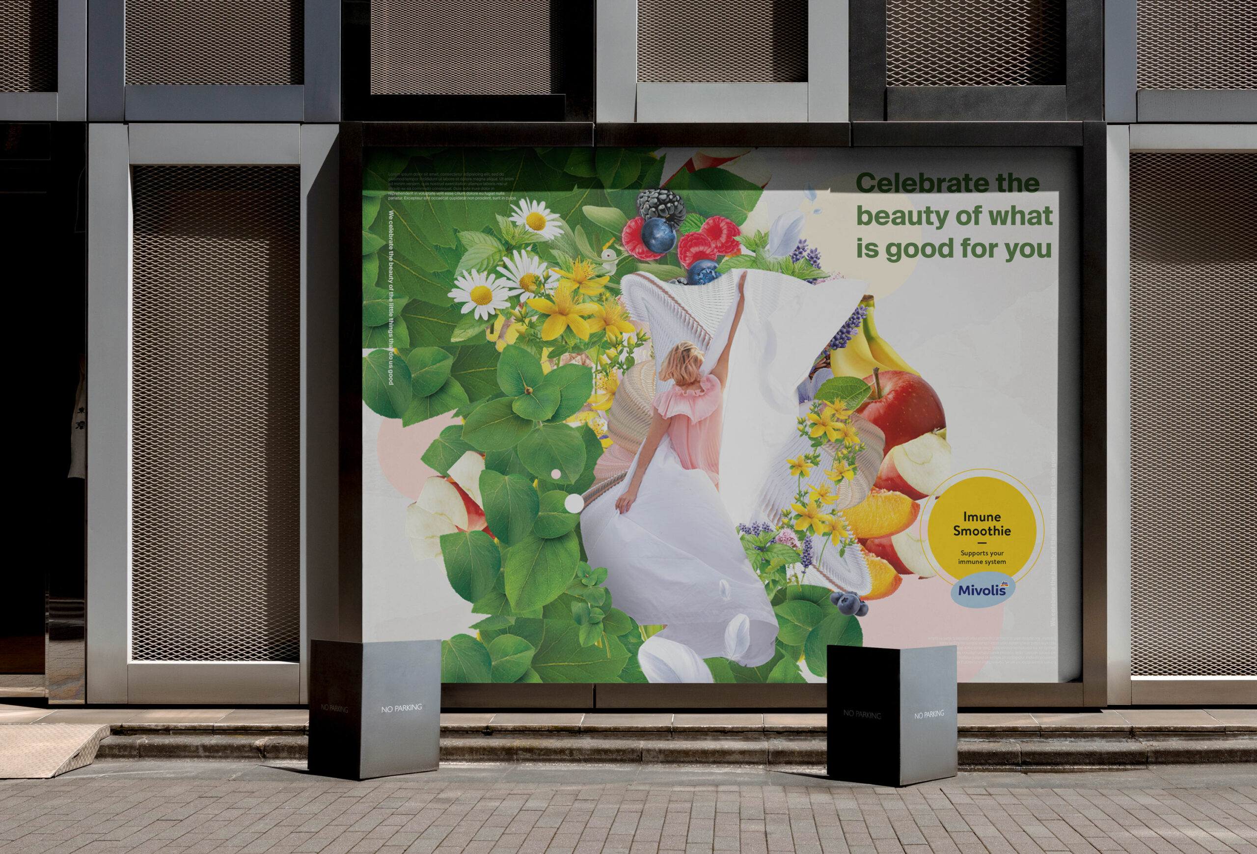
As one of Germany’s largest retailers, DM sought to refresh its flagship Mivolis Artifeel private-label line—a brand known for its human-centric ethos and holistic approach to well-being. The challenge posed to me wasn’t just to update hundreds of product designs but to craft a system that could scale effortlessly across categories while standing out in a saturated market. The new identity needed to feel distinct, approachable, and deeply connected to Artifeel’s purpose of enriching everyday life. Impressed by the brand’s ethos, I developed a generative branding tool inspired by DM founder Götz Werner’s philosophy of individuality and connection. This dynamic system translated Artifeel’s values into organic, evolving visuals that felt alive and personal. By drawing from natural forms and vibrant textures, the tool created unique, on-brand designs for each product while maintaining a cohesive, approachable aesthetic guided by a human touch.
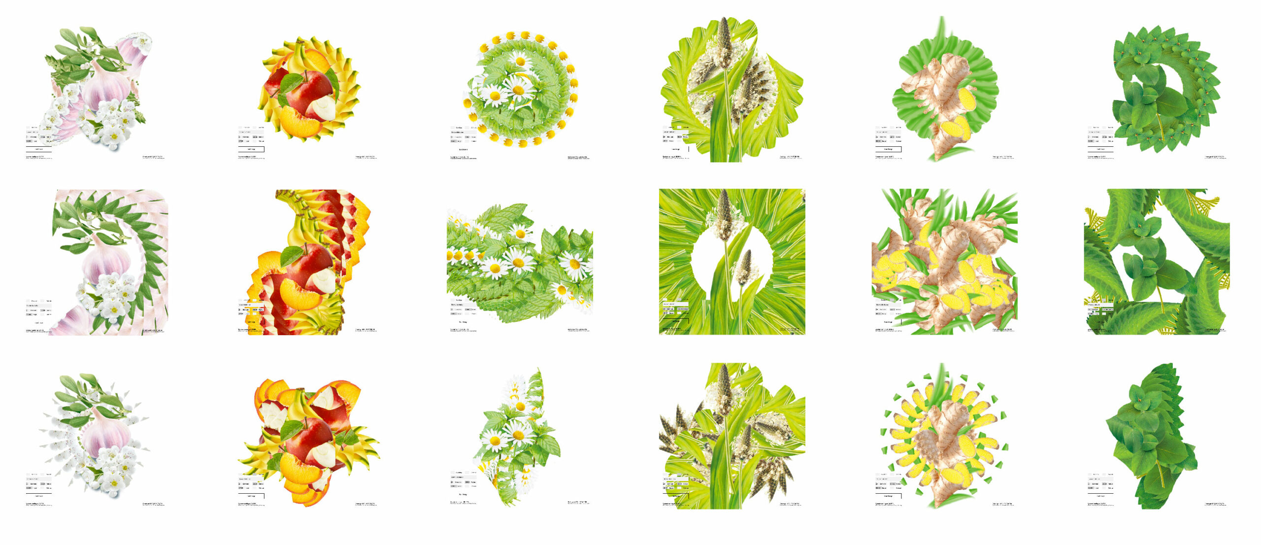
At the heart of this solution was a commitment to scalability and human connection. The tool streamlined creative production, enabling rapid and tailored design creation for hundreds of SKUs —from packaging to key visuals— but still required human intervention for each fragment to celebrate individuality, build trust, and redefine how private-label brands can inspire and connect.
The generative branding tool was designed to bridge the gap between automation and artistry, ensuring that every product reflected Artifeel’s ethos of holistic well-being. By using natural, fluid forms and vibrant textures, the system generated designs that felt intuitive and alive, resonating with the brand’s commitment to individuality. Each output was not a mere template but a unique visual identity tailored to its specific product category, maintaining consistency without losing the personal touch.
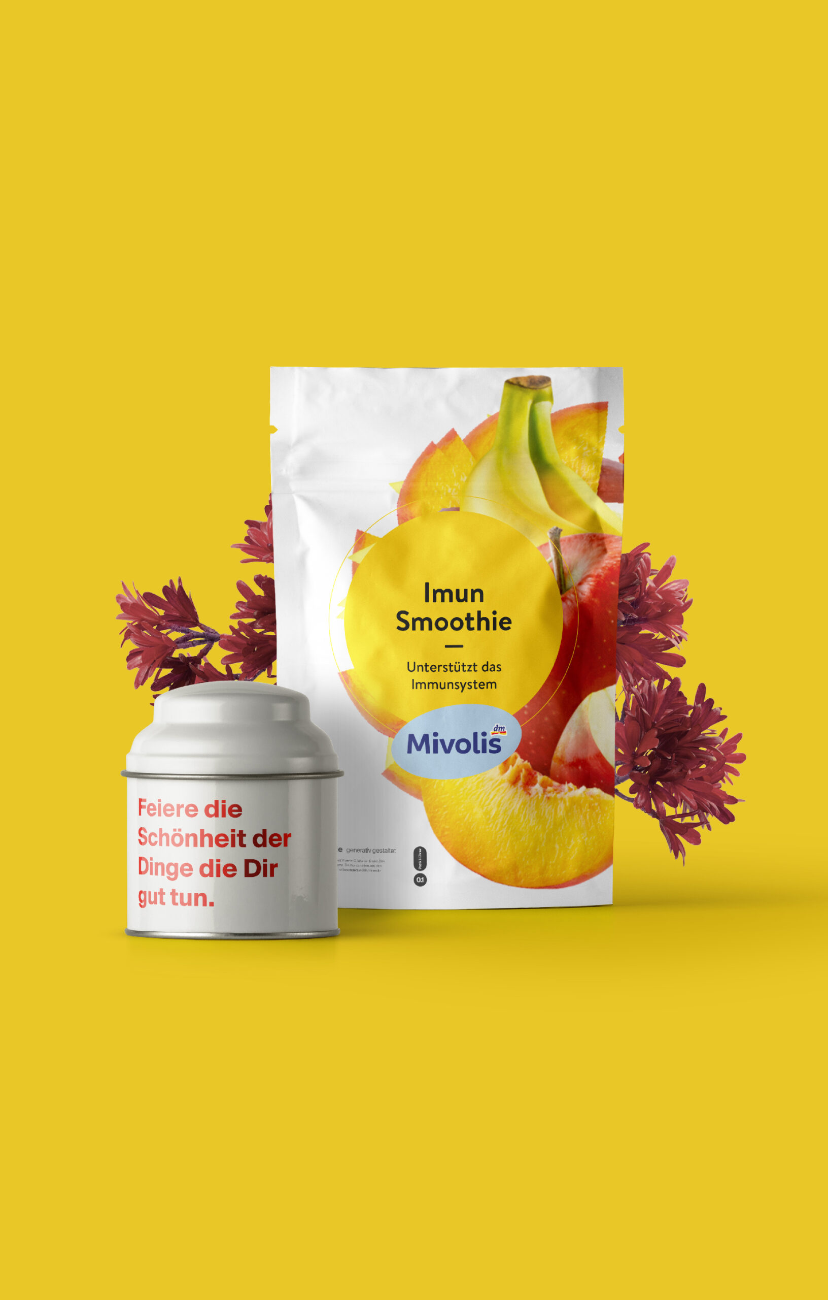
The scalable and generative packaging designs were crafted to meet the dual demands of efficiency and individuality, providing a cohesive visual identity that could seamlessly adapt across hundreds of SKUs. Using a generative system, each design was built from a core set of principles inspired by natural forms and vibrant textures, ensuring consistency while allowing for unique expressions tailored to each product. This system enabled rapid design creation, significantly streamlining the packaging process without sacrificing creativity or attention to detail.
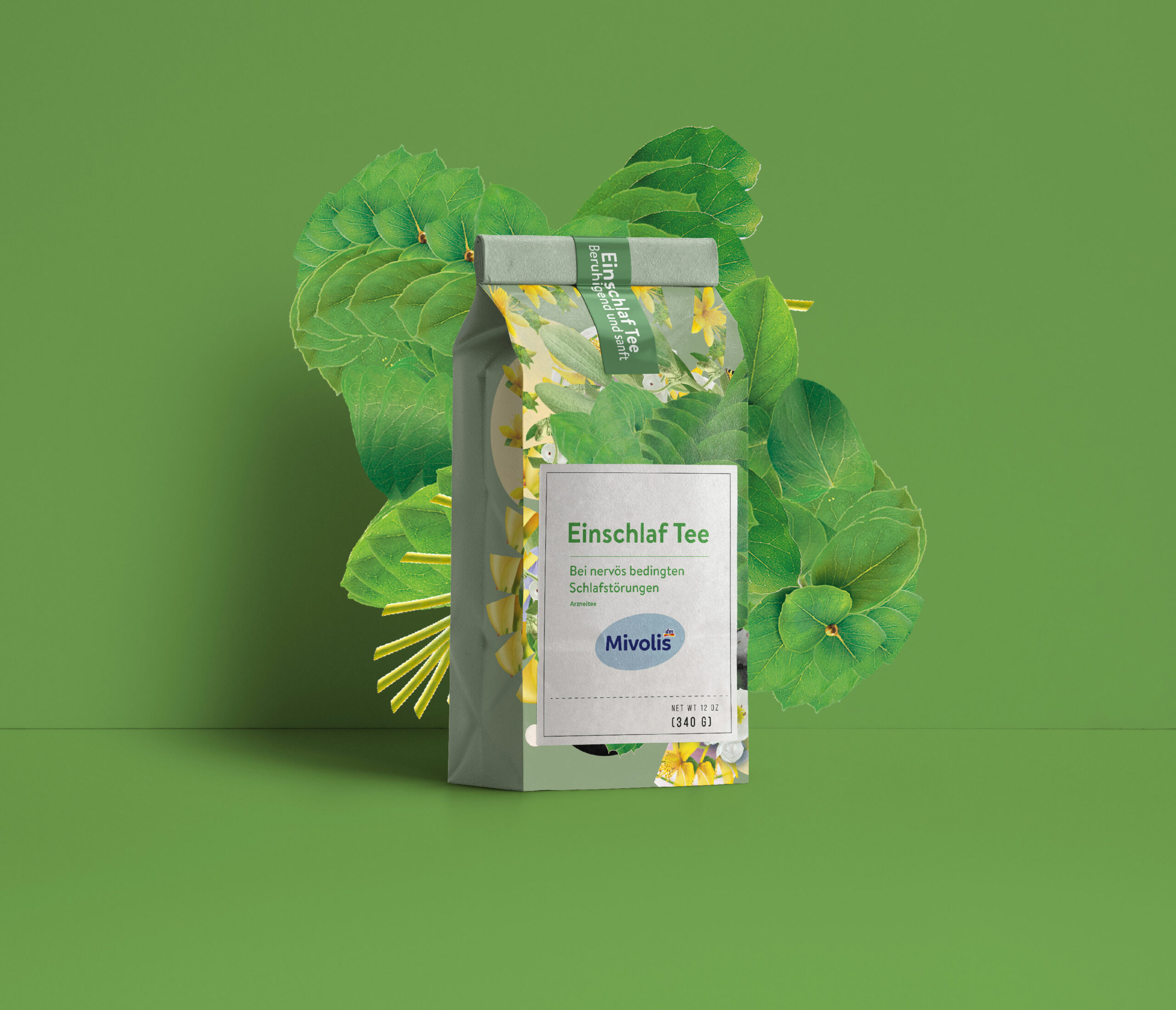
The adaptability of the tool allowed it to scale effortlessly across product categories, from wellness supplements to skincare, creating a unified brand presence. By embedding scalability into its DNA, the packaging not only stood out in a crowded market but also reflected Artifeel’s ethos of connection and personalization, making every product feel thoughtfully designed and deeply aligned with the brand’s purpose.
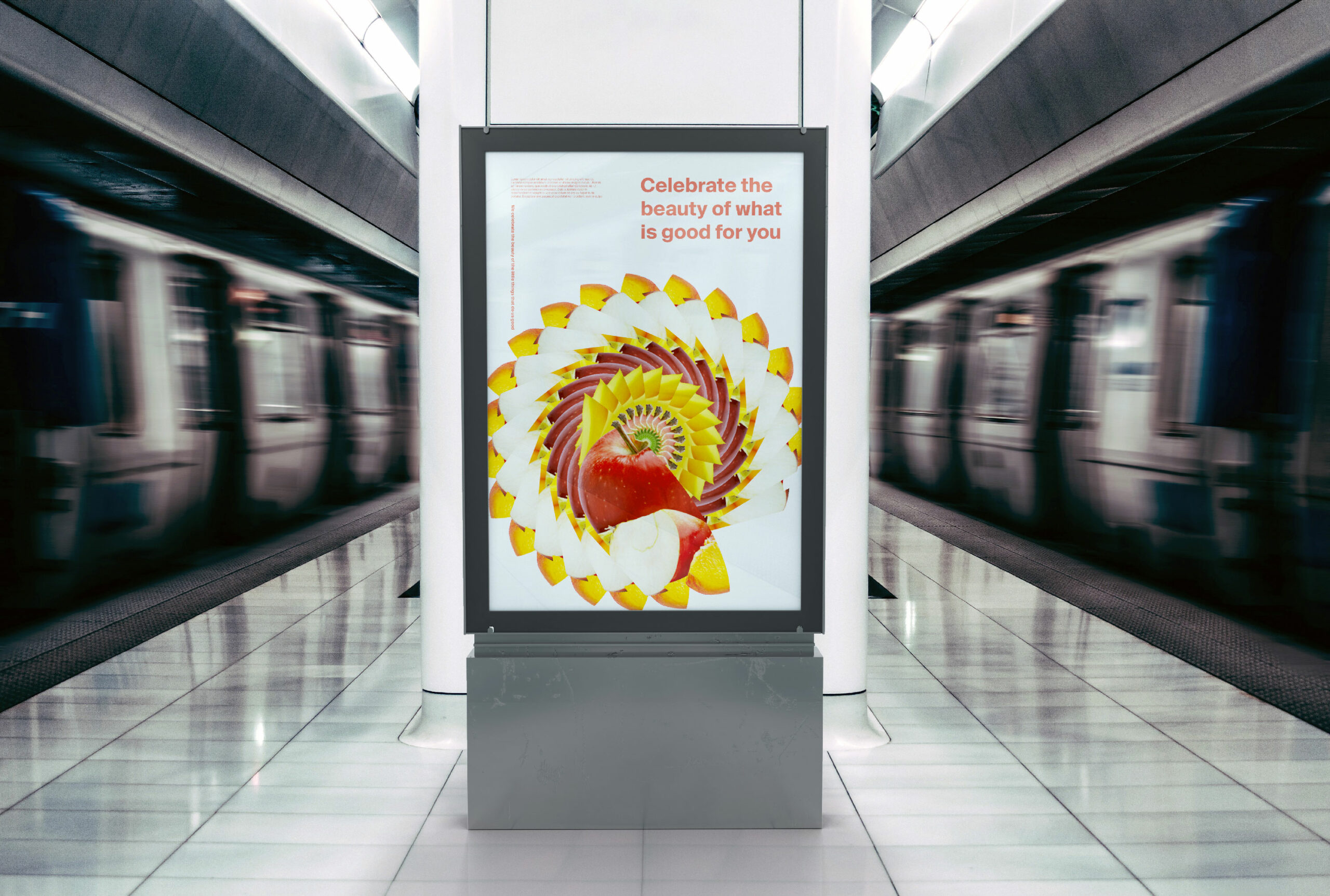
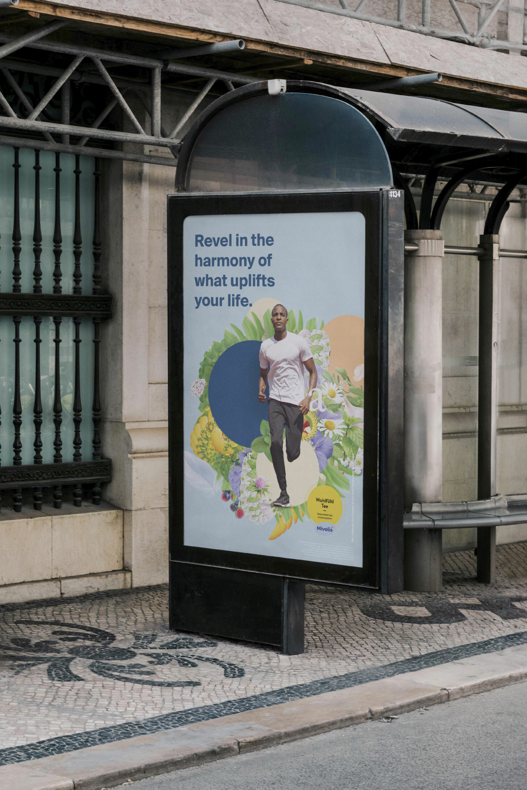
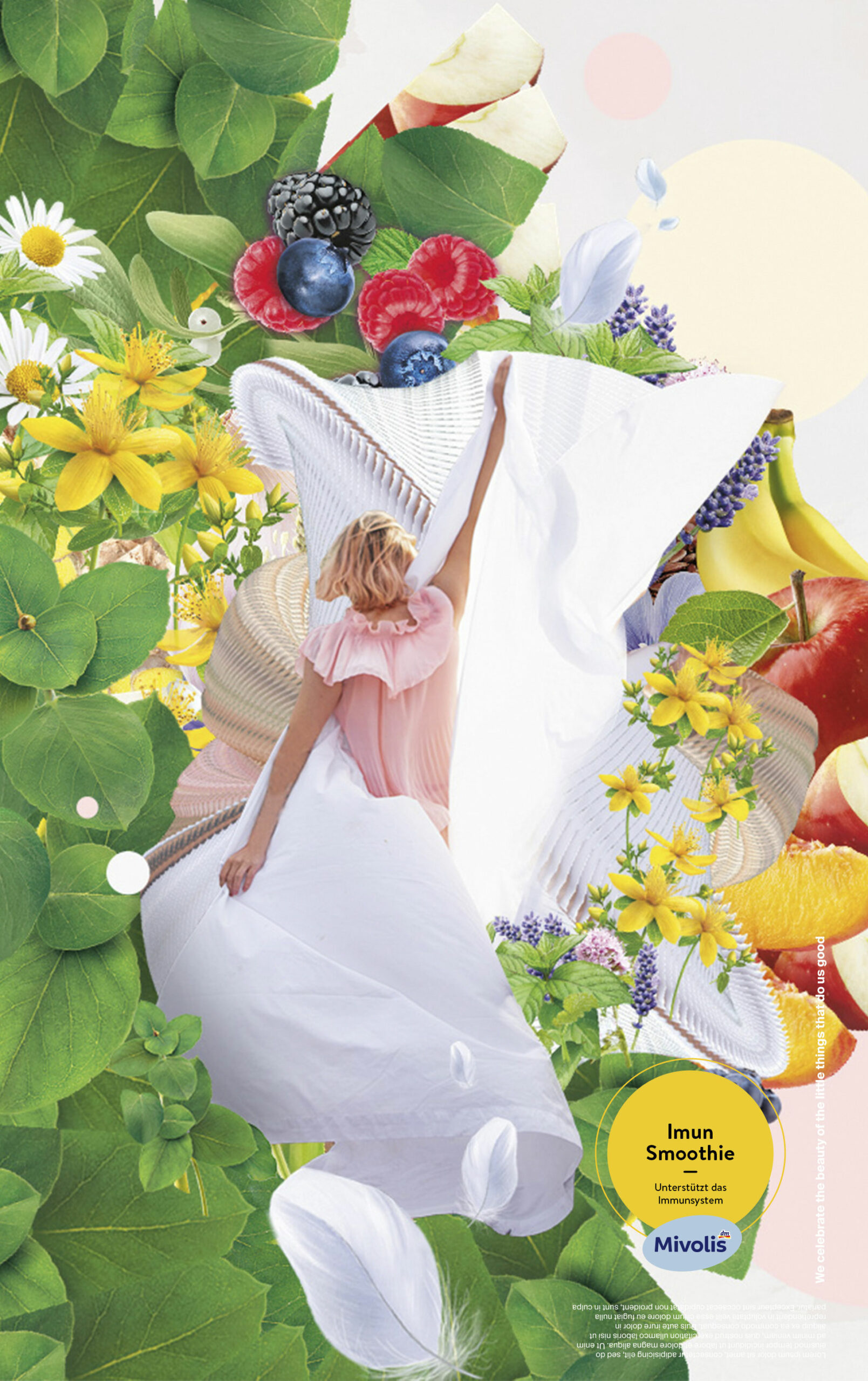
The vibrant yet balanced color palette added warmth and energy, ensuring the designs stood out as keyvisuals and on crowded shelves while fostering a sense of trust and connection with the audience. This visual language was designed to be a signature of the brand and to reinforce its ethos of personalization, creativity, and care.