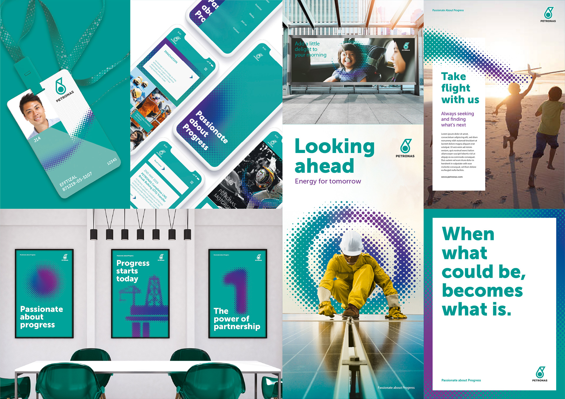
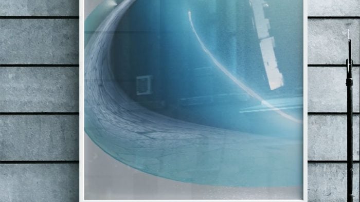
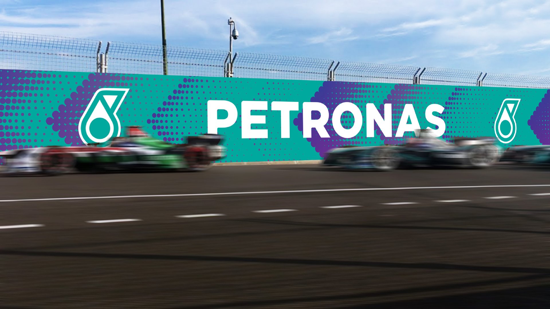
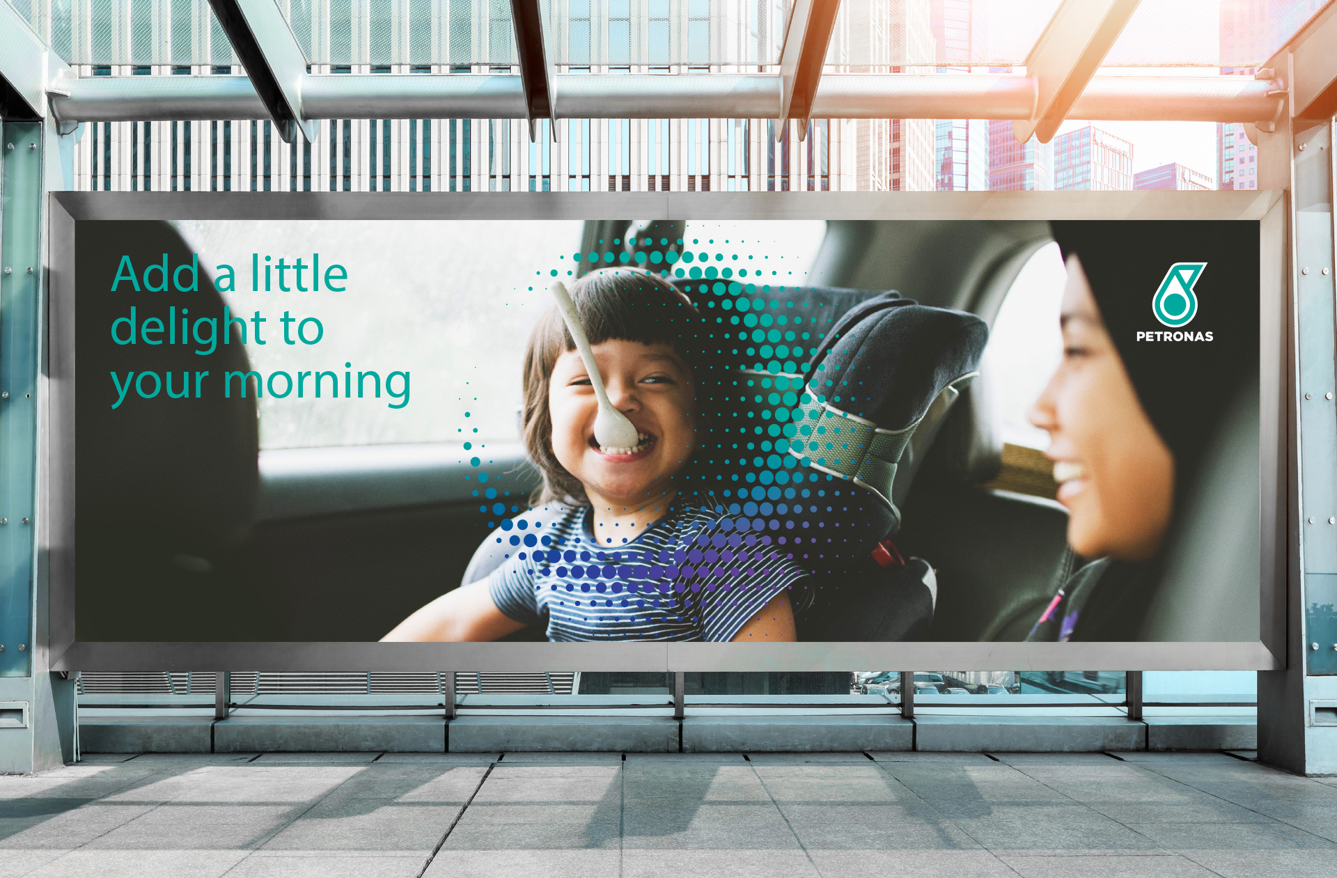
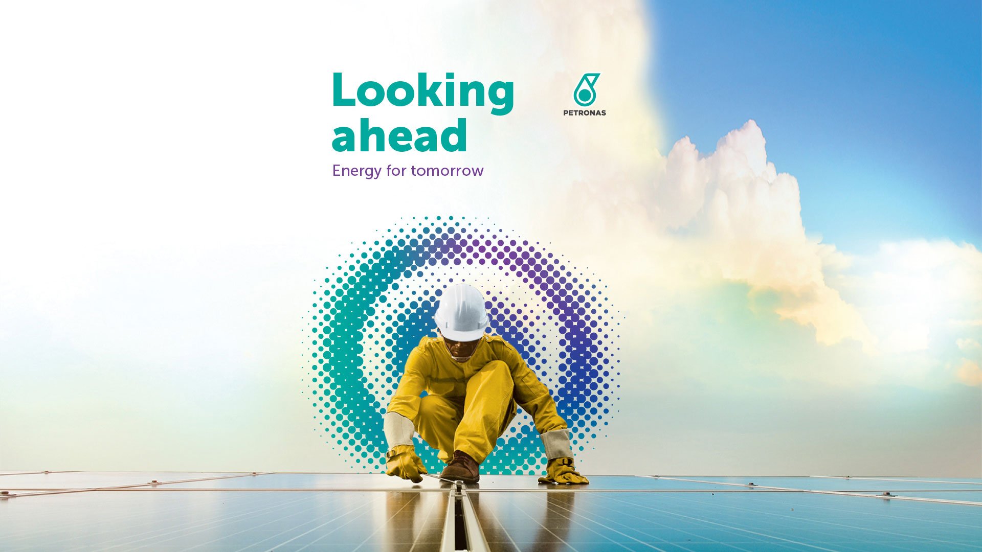
PETRONAS. An ever-evolving, flexible design system to inspire change. A brand design that constantly evolves, just like the way energy flows – taking on infinite forms.
Agency Dragon Rouge Singapore invited me to bring to life their idea of a flexible visual design system which recognizes the multiple forms in which energy exists. An idea that reflects the various facets and states in which energy can exist – from the electrons of the sun, to the carbon molecules of our earth, to the latent potential that lies in every individual. This is exactly what each “PETRONAS dot” represents. The identity pays homage to Petrona’s core identity and emphasizes the brand’s expertise and technological capabilities.
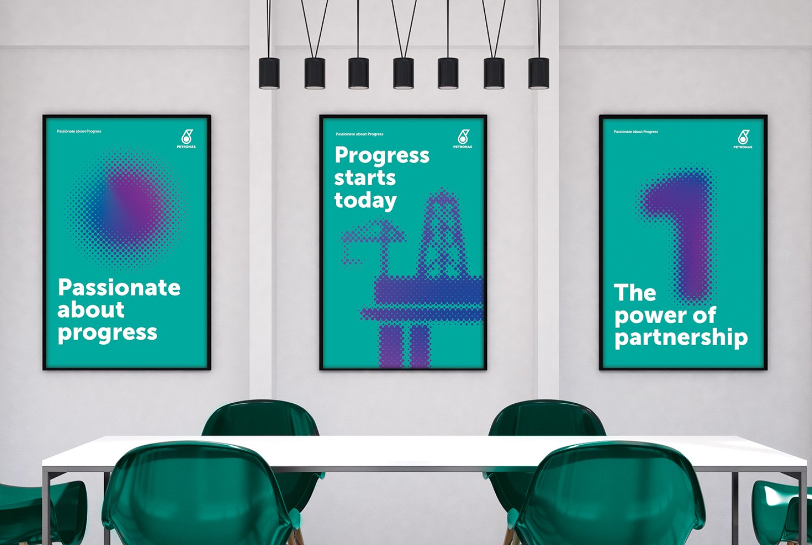

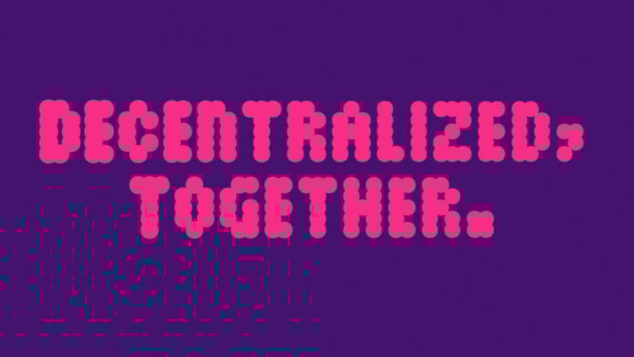
The new identity was designed as an ever-changing and constantly evolving entity. To inspire a fundamental, transformative progress to create better solutions that benefit people and our planet.
Each dot that connects brings the company closer to the goal of achieving net zero carbon emissions by 2050.
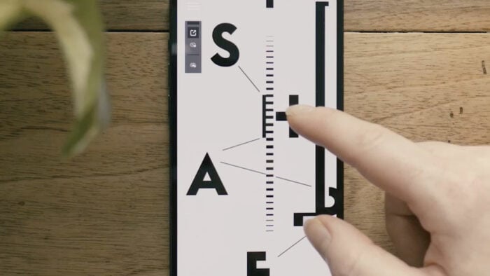
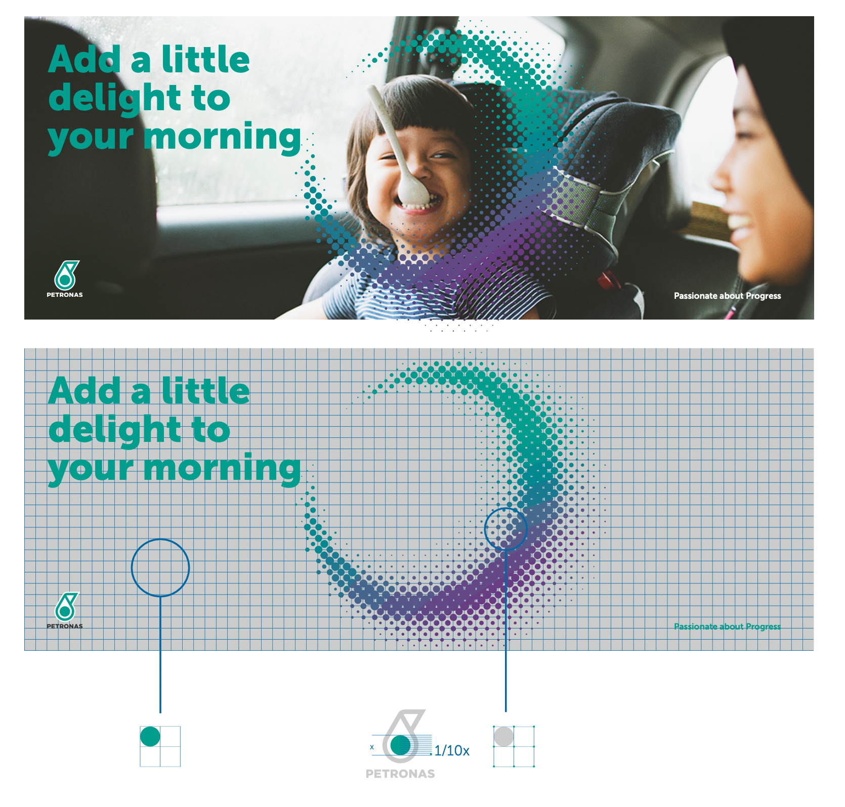
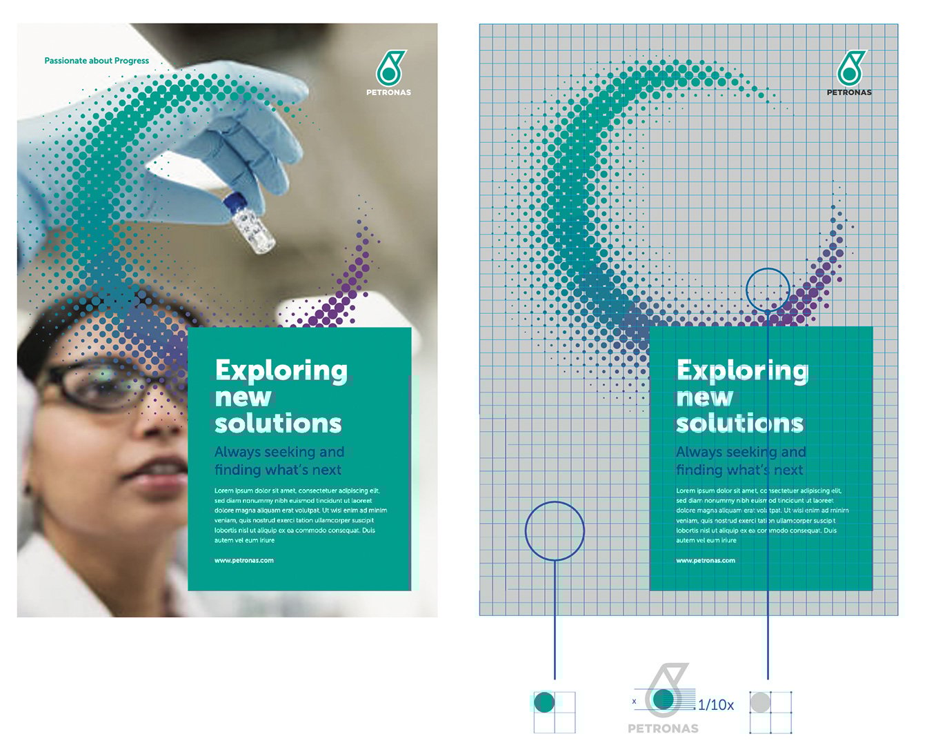
The design system’s precise structure is rooted in PETRONA’s logomark: The size of the logo in any collateral directly determines the grid system and each unit within it. Any change to the logo immediately affects the grid as well.
It serves as a guiding principle in positioning elements within a composition as well as the measured structure to create graphics and illustrations.
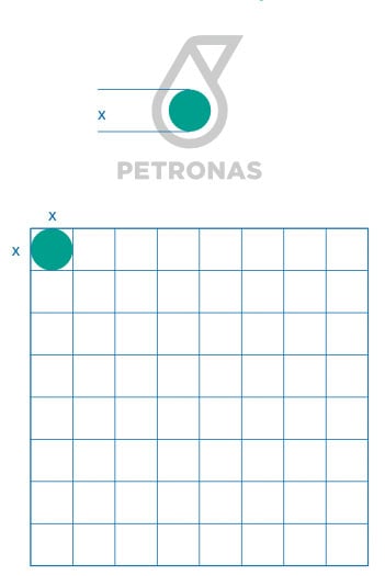
The size of the logo determines the grid system. The circle in the logomark is used to determine the unit of the grid. Therefore the change in the size of the logo will affect the grid as well.
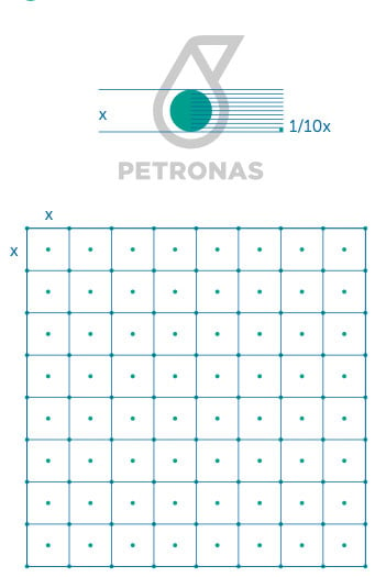
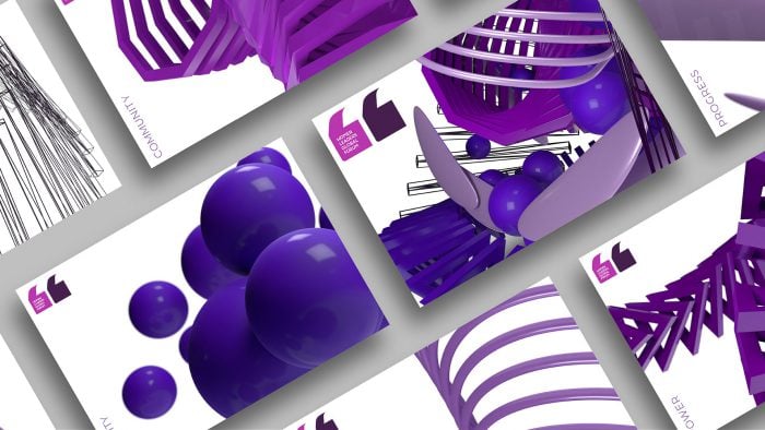
The grid system determines the foundation and position of the circles. By changing the size of the circles within the range of its largest and smallest size, infinite expressions of the circles graphic can be brought to life.
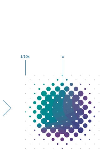
The circle element of the brandmark is used to determine the largest (x) and smallest (1⁄10)x unit of the PETRONAS Dots.
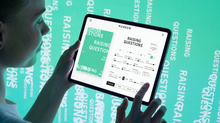
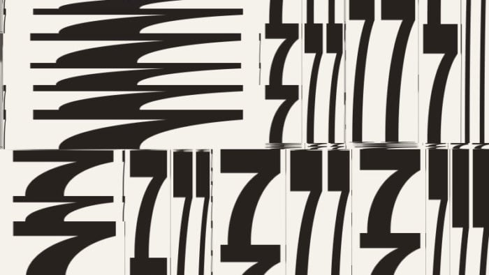
I developed a flexible, dynamic and generative graphical system which is used as the backbone for all elements in a communication’s application.
The system consists of three core modules: A dot-pattern generator, an image-to-dot abstraction module as well as a free-form drawing module which makes it possible to paint and draw with the dots.
The flexible visual design system is extremely approachable due to its ease of use and can thus be used by a large number of employees, turning the brand into something that is truly constantly evolving. All the while establishing a clear connection to the brand’s identity and core beliefs.
The Generative Design and Creative Coding based approach allows a large amount of employees to contribute to and connect to the brand. The system can output high resolution files as well as scalable vector files and motion pieces at the simple click of a button.